Web design is more than just what looks good – though this is important too. A well-designed website can engage with potential customers, inform them, sell the benefits of your products or services, and be an effective sales tool.
A badly designed website on the other hand, can turn a customer away. Whether it’s an ugly website giving a poor representation of your business, or a confusing one which even a spirited customer gives up on, bad design can hurt your chances of making a sale.
Trends will come and go as fashions evolve, but here are the key staples that must always be considered when building a website that gets results.
1) Make an immediate impact
Web users are, in the main, impatient beings. With a wealth of resources available at the click of a mouse or a tap of a screen in just a few seconds, it’s important that your website grabs the visitor’s attention instantly.
You’ve got just a few seconds to convince them that they’re on the right website before they start looking elsewhere. That means branding, bold visuals and key messages go right at the top, equally so whether it’s a desktop browser or a mobile phone screen.
And that latter distinction is a key one. Today, more than half of all web traffic occurs through mobile devices. If your website can’t easily be viewed this way, you risk as many as half of your visitors instantly clicking the back button.
2) Simplicity is key
While important information should be front and centre, we’re only referring to the vital stuff, not absolutely everything. An overload of information can be overwhelming.
Too many links can make a website hard to navigate. Too much text outside of the right setting won’t get read. Strip out anything that’s not necessary. Pare back what’s left. Then make it all intuitive to find.
View your website through the eyes of a first-time visitor. Have their goal in mind and see how few clicks it takes to get to what they need.
3) Accessibility and usability
While advancing technology is making all sorts of weird and wonderful design elements possible, it’s not necessary (or advisable) to use them all.
Many web users have less than perfect vision, for example, which is something National Rail forgot when they turned their entire website grey to mark the passing of Prince Philip earlier this year. A flood of users took to social media to complain that it had made the site unusable to them, and what the company thought would be a nice PR move turned into the exact opposite.
Consider providing transcripts of videos, and detailing photographs in the description tab. Avoid using elements which require the use of a mouse. And Dark Mode is becoming increasingly prominent across the internet, using darkers colours to help protect the eyesight of users.
Just as would be the case when designing your premises, your website design must take into account the full spectrum of needs of potential users, otherwise you risk turning them away.
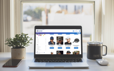
4) Images, video and beyond
The better a customer understands what they’re considering buying, the more likely they are to part with their money. Shoppers want to inspect their potential purchases, and visual representations are a vital way of enabling this.
High quality photographs are an absolute must, and worth your investment. Video is increasingly becoming part of online catalogues, whether that’s an outfit on a model, a simple demonstration of a tool in use or drone footage of a property.
While professional production is a bonus, these can be produced on a budget using off-the-shelf technology and editing software. But where there is budget available, augmented reality is emerging as an exciting new tool. It can be used to enable a product to be viewed from a variety of angles using handheld devices, it can insert a product into the user’s surroundings, and it can add ‘virtual’ labels to a real-world product the viewer is holding in their own hands to aid their understanding and enjoyment.
5) Social proof
Say what you want about how amazing your own product or service is, the glowing reviews always carry more weight when spoken by an independent third party. That’s why major retailers carry customer star ratings and reviews on product pages.
You can use external sites to gather reviews of your business, such as Trustpilot, which bolster credibility. Then use their widgets to seamlessly embed up-to-the-minute reviews on your site.
Hearing from satisfied existing customers gives added confidence to potential new customers and increases your chances of making a sale.
6) Calls to action
Whatever design decisions you make when putting together your site, you should have an end goal in mind.
When you’ve defined the purpose of your site – that is, what you want your visitor to do – you need to make that action especially obvious to users. If you’re collecting email addresses, make it clear where users can enter their information and give them a reason to do so. If you’re arranging appointments, explain the benefit of two-way communication and make it easy to book a time and date.
Ultimately, the design of your website should centre around the action you want potential customers to take, and then provide very clear signposts from initial interaction to completion to make the process as straightforward as possible.
Discuss Your Project With Us
You can either give us a call on 01254 279998
Or complete the contact form below and a member of our team will call you back.